A while ago, Lea Verou argued that in a website, a dark mode toggle only needs two states1: light and dark, and a “system” preference.
Many other experts wanted to give their take on the argument. Vale (Declan Chidlow)2 found it “a tad too magical” to have system as an additional option, and proposed that the system would set the colour scheme from the get-go. Bramus was in the 3 button side of the debate3, and didn’t ”… believe that being able to force a site into a specific mode should be dependent on the time of the day.” On the other side, Marcin Wichary4 was against the 3-state side, and Josh Collinsworth5 reiterated that Lea got it right the first time.

This ran for weeks. And it was refreshing to see how professionals and peers had their own educated opinion. Lea Verou continued6 on a subsequent article, positing that the best toggle is probably none. If it’s deemed important to provide a toggle to the user, then it should be located within the settings. She sent her article to a colleague with an HCI (human-computer interaction) PhD for review. After a back and forth regarding if a dark mode toggle was even commonplace in websites, on her searching she noticed that every persistent toggle found was on sites built for developers.
I could not think of a single well-known consumer-facing site with a persistent dark mode toggle.
Lea Verou
Other7 professionals8 had9 fun10 takes11.
As developers we tend to fall into a false consensus12, thinking we’re the target audience of the products we make. I myself built that toggle more than once, on smaller projects. Where it’s likely I have a captive target audience of 1 😅.
So don’t ask
Colour is a design decision, there’s a reason why colour schemes are the way they are. There is room to respect the user’s decision of light and dark mode, if the theme allows for it, but it shouldn’t take the centre stage.
In nearly every project I’ve worked on, the design goes through an iterative process of experimentation and user testing. Since CSS variables13 became baseline in all major browsers, it’s been easier to define brand rules, colour variations and beyond.
But what if colour also becomes part of the iterative process? What if we don’t limit to a light and a dark and a “Green, actually” theme?
And now for something completely different!
If you’ve been reading up to this point, we salute you! This was all a ruse so I could talk about themes. Thinking about how colour compliment each other in a similar layout is fun! On my site you may find a vast array of themes throughout all pages and articles. The blog archive showcases what colour scheme each article might use, and I have a hidden page to help me pick from those I had already made.
But how does it work, making themes granular to the point that it can be set on a page item level?
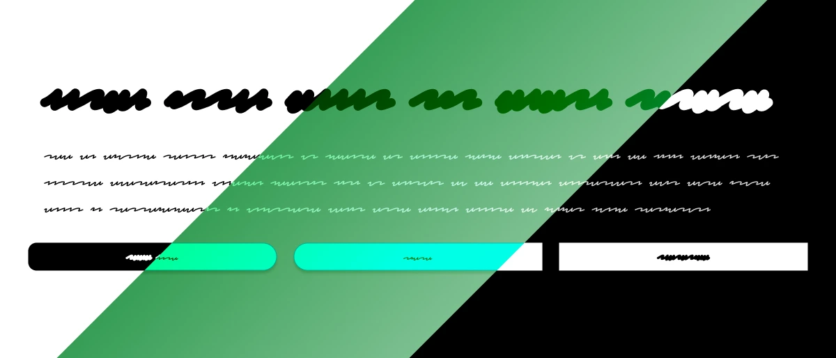
My process works more or less like the :root {}14 pseudo-class, but I scope it into an element attribute. A data attribute15 in fact! I named it data-theme.
Subtitle
Title
Lorem ipsum dolor sit amet.
Subtitle
Title
Lorem ipsum dolor sit amet.
Subtitle
Title
Lorem ipsum dolor sit amet.
The markup can be exactly the same, and the data-theme derives the differences.
I’m not claiming this a novel idea, and I’m not the only one talking about it. For example, Una Kravets16 called this a microtheme. Even though her article veers more on using css to adapt colours based on backgrounds, it follows the same spirit.
Rolling for colours
Nearly every colour scheme I created was generated from images or randomly using my colour palette tool. The page listens for an image paste anywhere on it, which is helpful when i find an image that translates the exact colours I’m looking for. I set the output for HSL, because it makes it easier (at least in my methods), in case I want to nudge a lightness manually without complicating with calculations.
Then I check the maths
HSL (hue, saturation and lightness) is a handy colour format to easily adapt colours, but not so great to analyse between them. the lightness value is the average of the brightest and dimmest channel, so it treats yellow and blue as equally bright. hsl(60 100% 50%) (yellow) and hsl(240 100% 50%) (blue) both have 50% lightness, and on white the yellow has a WCAG (Web Content Accessibility Guidelines) 2 score of 1.07:1 while the blue scores 8.59:1.
WCAG 2 measures relative luminance17, and it calculates it on sRGB (standard red, green and blue) channels. Each channel is divided by 255, and is weighted by how bright it looks, relatively. It runs from 1:1 to 21:118, and AA requires 4.5:1 for text versus background.
const relativeLuminance = ([red, green, blue]) => {
  const linear = [red, green, blue].map((channel) => {
    const value = channel / 255;
    return value <= 0.03928 ? value / 12.92 : Math.pow((value + 0.055) / 1.055, 2.4);
  });
  return 0.2126 * linear[0] + 0.7152 * linear[1] + 0.0722 * linear[2];
};

const contrast = (txt, bg) => {
  const txtLuminance = relativeLuminance(txt);
  const bgLuminance = relativeLuminance(bg);
  return  (Math.max(txtLuminance, bgLuminance) + 0.05)
          / (Math.min(txtLuminance, bgLuminance) + 0.05);
};
WCAG 2 is considered the legal minimum19, required in many professional fields. In the near future, APCA (Accessible Perceptual Contrast Algorithm) will probably model better, but as of April 202620 the WCAG 3 draft contrast algorithm is yet to be determined, so for now WCAG 2.221 is the official recommendation.
What else should we keep in mind?
Some high contrast accessibility settings in operating systems may push for Forced colors22 mode, which may affect any theme negatively. In this situation it’s best to test for good ol’ graceful degradation23 ❤️
Making things readable and accessible, equitable designs, does not remove the fun of the craft. Some of us shine like diamonds, working within constraints. Let’s add colour and style the world our own way, and keep toggles to a minimum!