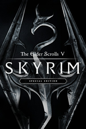
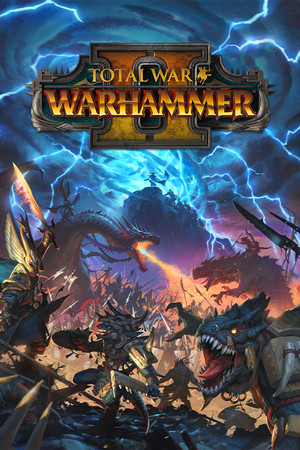
The grid above is 27 game covers and about forty lines of CSS. The only JavaScript on the page is the console shim CodePen injects into every pen.
I built it in December 2019, a few months after Steam replaced its library with the big box-art grid, because I wanted to know how the cards worked. Here is what each part of it is doing.
The grid is flexbox: display: flex, flex-wrap: wrap, and a gap. The cards are 2:3, which is the shape Steam serves its library art in at 600x900. Two of those declarations are younger than the pen, as it happens. Flexbox gap didn’t reach Chrome until version 84 in July 2020, so the original spaces its cards with margin: 1rem on each one, and aspect-ratio arrived later still in Chrome 88, so back then the card had no height of its own and took the shape of whatever image landed inside it.
For the rounded corners I put border-radius on the wrapper and overflow: hidden alongside it. The second one does the actual work. border-radius on its own rounds the wrapper’s background, and the image inside paints straight over the corners. The image also wants display: block, or it sits on the text baseline and leaves a pale three-pixel sliver along the bottom edge of every card.
rotateX on its own does nothing useful. Rotating around the X axis with no depth information squashes the element vertically, because the browser has no idea how far away the viewer is meant to be. perspective(50em) supplies that distance, and it has to come first in the list, since transform functions apply right to left. Smaller values put the viewer closer and make the effect more violent. At 10em the cards look like they’re falling over.
You can also set perspective as a property on the parent instead. That builds one 3D scene with a single vanishing point at the centre of the container, so cards near the edges lean in toward the middle. The function gives each card its own vanishing point, centred on itself, so they all tilt identically wherever they sit in the grid. For a library of independent cards, the function is the one you want.
For the glare I used a pseudo-element holding a diagonal gradient, blown up to twice the size of the card and slid across on hover:
For the overlap I used z-index: 10 on the hover state, which is the line that looks pointless until you take it out. A transform creates a stacking context, and sibling stacking contexts with no z-index paint in DOM order, so a scaled-up card slides under every card that comes after it in the markup.